-
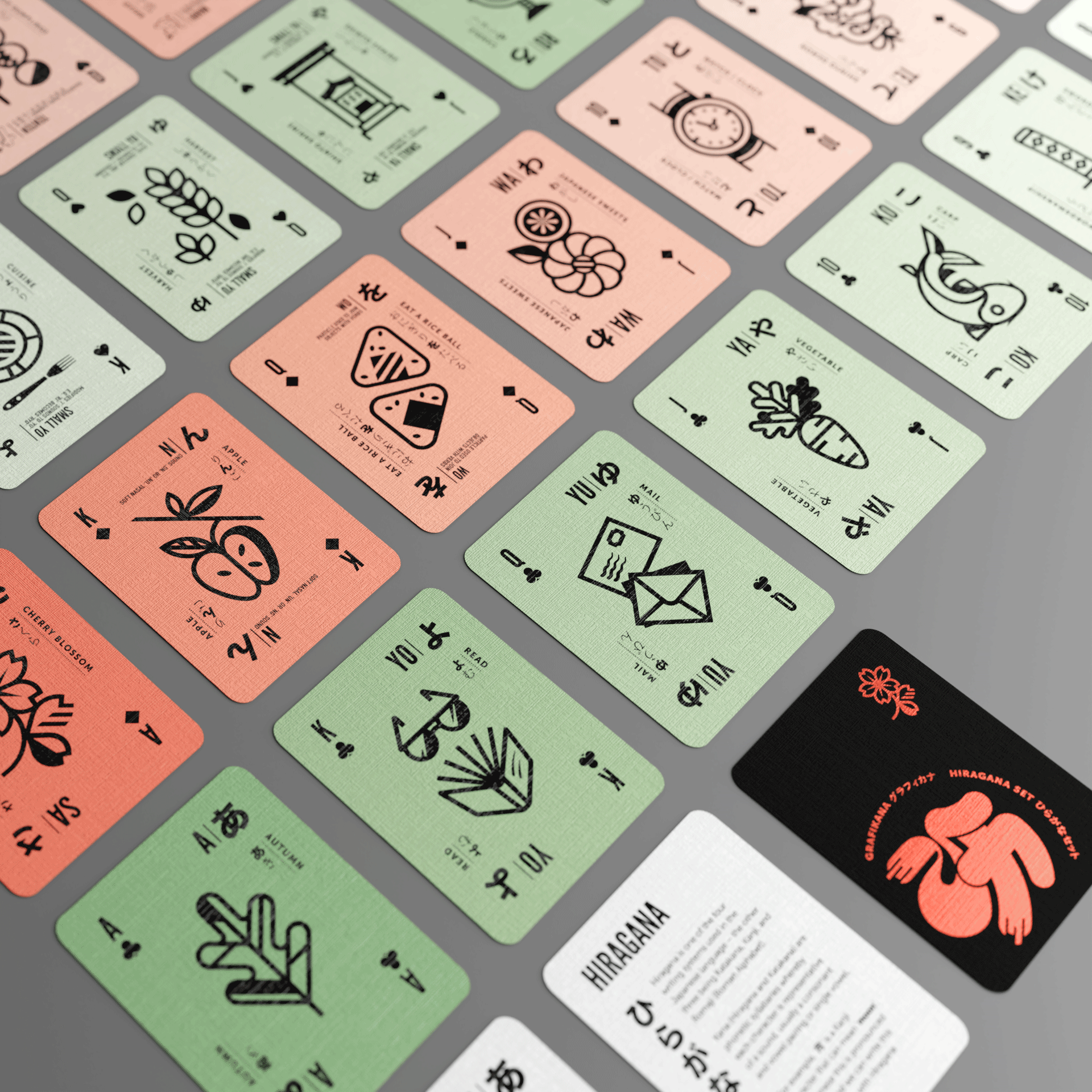
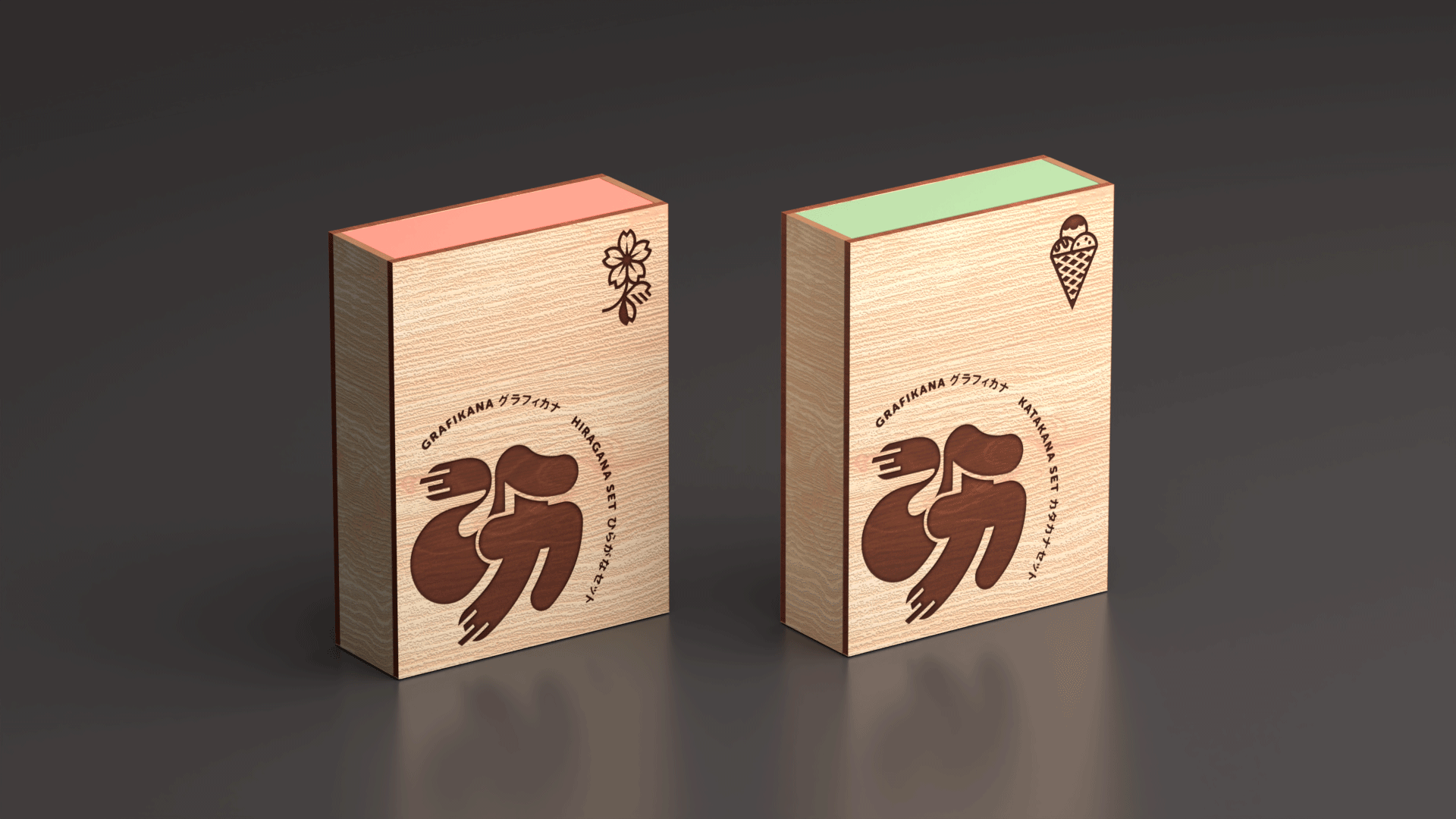
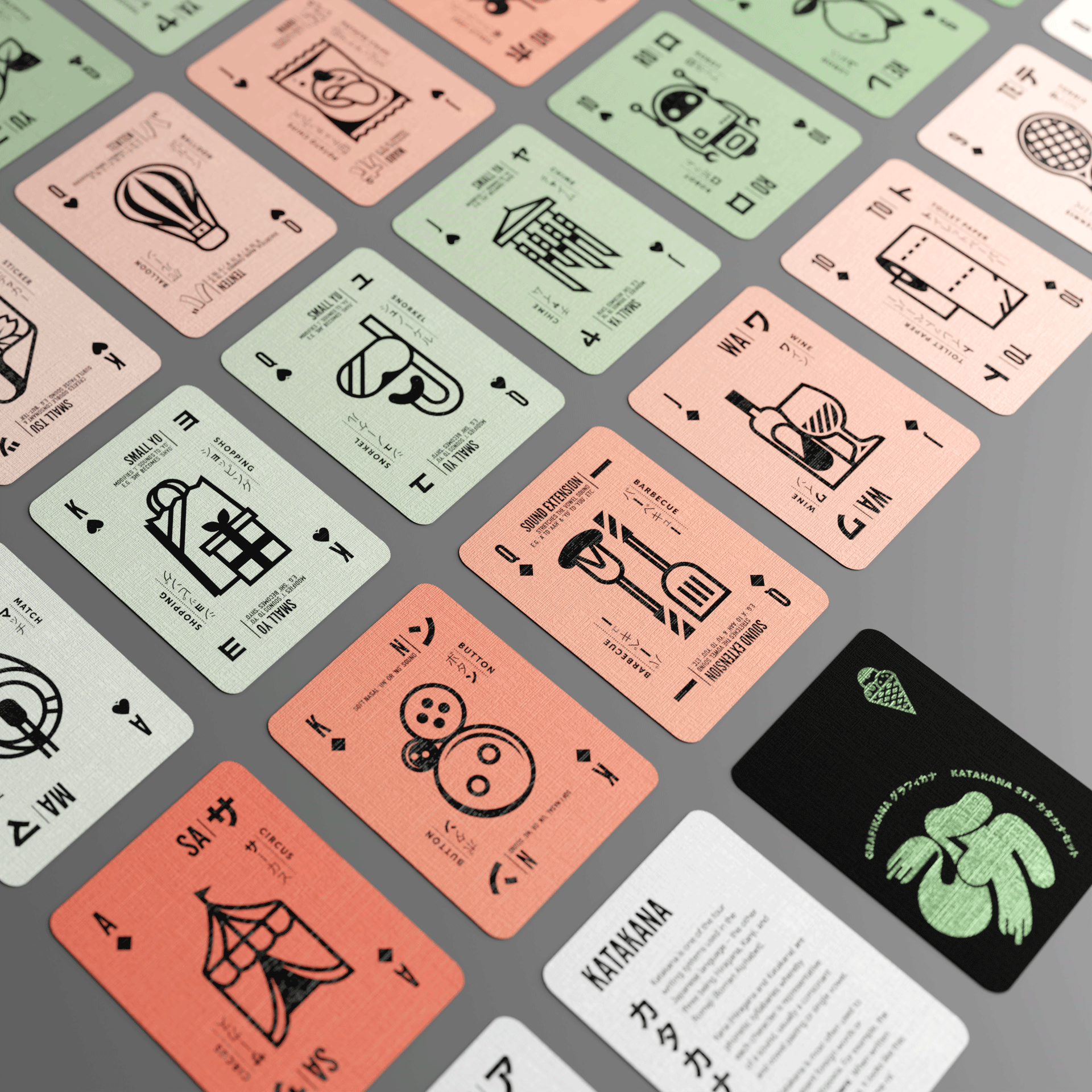
This was the passion project that I dove into during the stay-at-home Covid times. I had noticed the convenient alignment of the number of kana characters and the number of cards in a standard poker deck, and felt it was a marriage that might help beginner learners of japanese to incorporate play and repetition into their study in a manner they were familiar with.
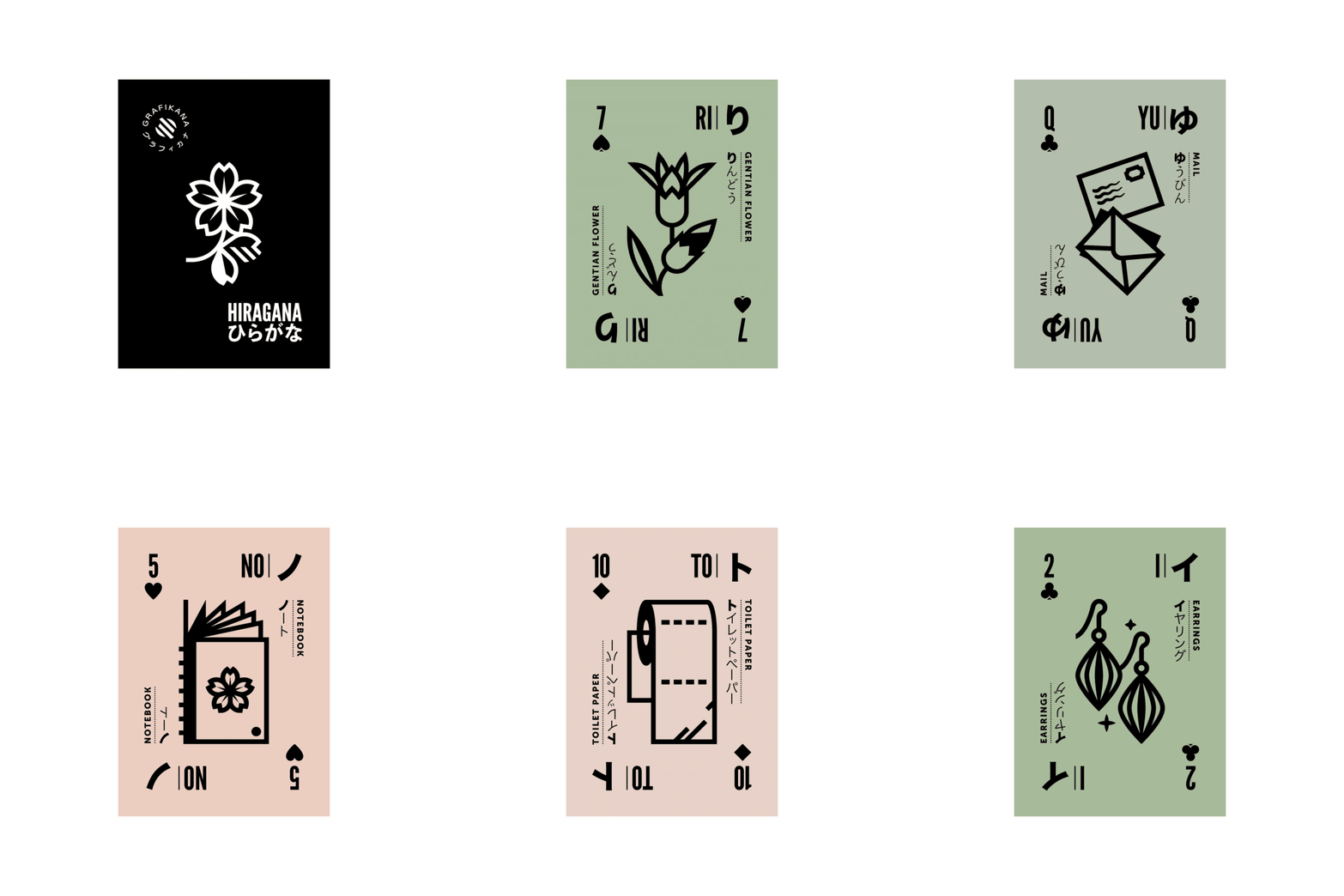
I wanted the icon design to feel simple, unified and ‘tidy’ so to be easily understood and approachable, yet with each illustration still having a unique individuality that made each card and character memorable.
The colour scheme in contrasting pink/green was chosen to clearly separate the Katakana series from the Hiragana, as well as using the pink for diamonds and hearts, and green for spades and clubs within the deck.


